Voodoo · Mob Jam
Short read · Interview challengeSmall shifts in a game that already works.
A UX/UI case study I did for an interview with Voodoo. I analyzed Mob Jam, one of their casual puzzle games, at a system level to find where players get stuck, and where small changes could make buying something feel earned instead of forced.
- Context
- Interview challenge for Voodoo
- My role
- Solo. Research, journey, UI analysis, proposals
- Platform
- iOS · casual mobile game
- Status
- Concept, not shipped
- Read time
- 2 minutes
01System-level thinking
I mapped the whole game before touching a screen.
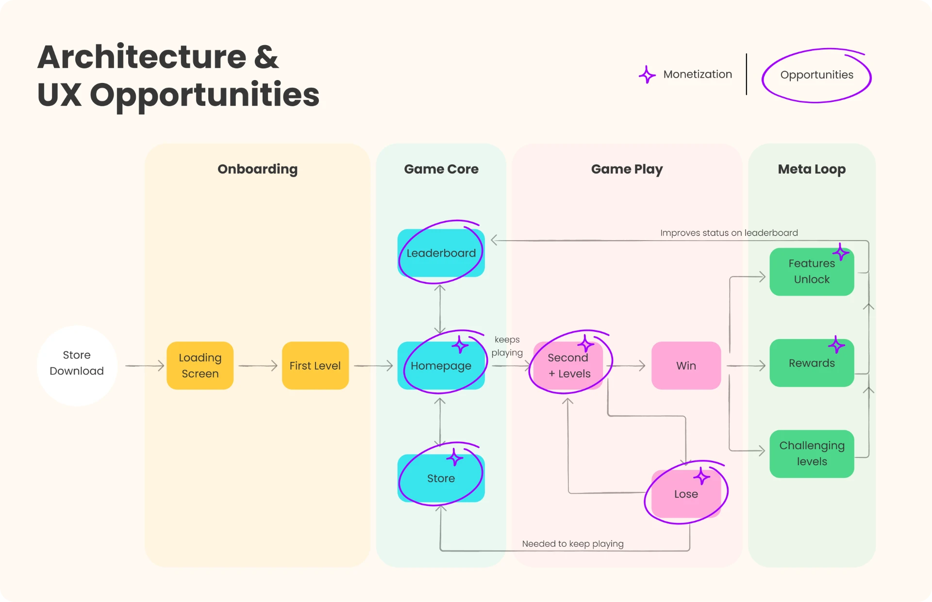
To find opportunities beyond individual screens, I mapped Mob Jam’s architecture: onboarding, game core, gameplay and the meta loop. It showed how modules support each other or create friction, and where UX could add clarity, engagement and room to scale.
02User journey
Then I followed a player from download to loyalty.
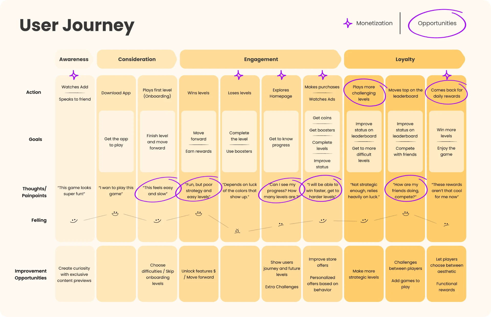
I mapped the first-time experience and the core loop, focusing on monetization moments and the frictions that could hurt retention and in-app purchases. Each stage has what the player does, thinks and feels, and an opportunity.
03UI analysis
On screen, too many things asked for attention.
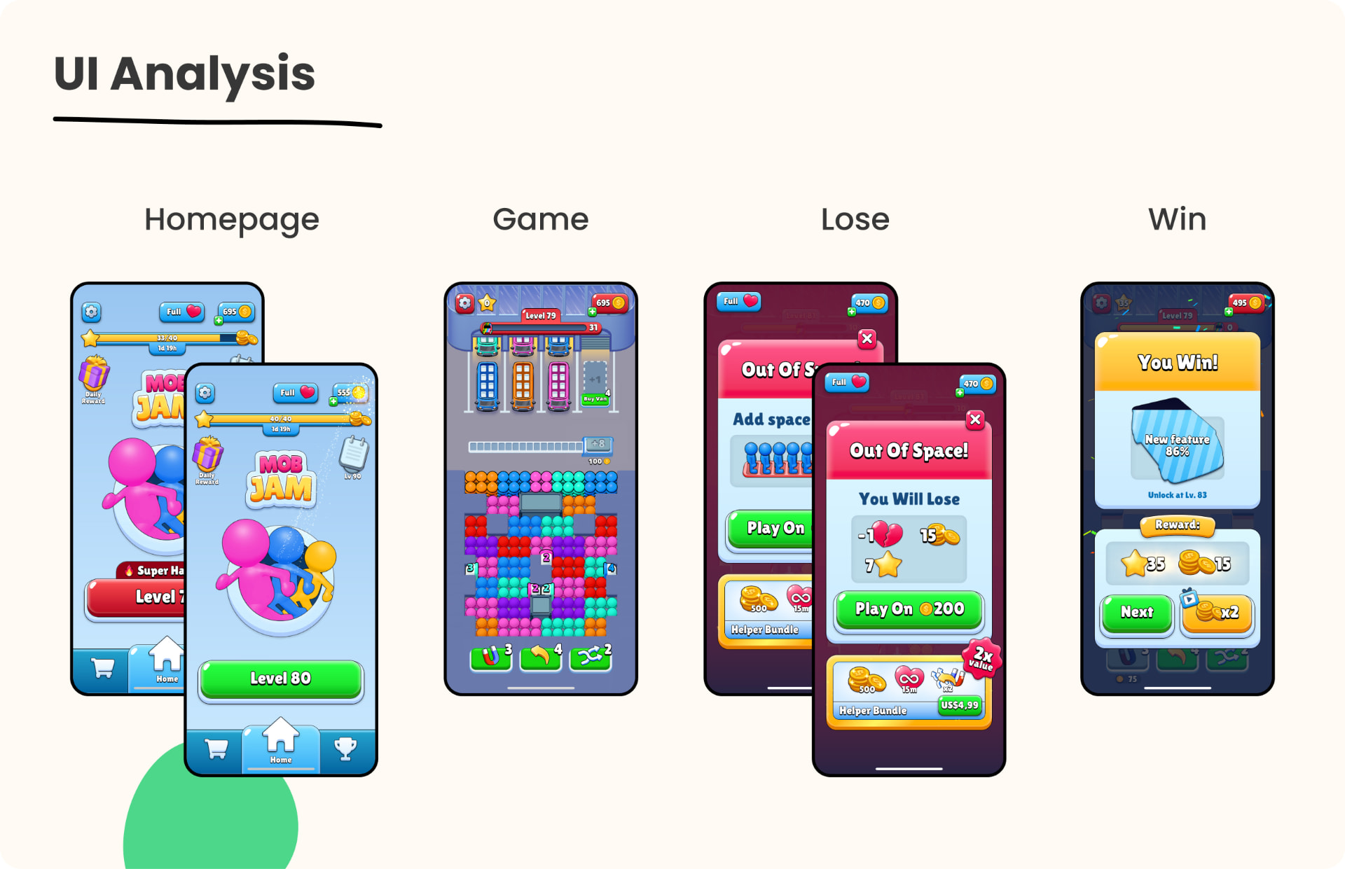
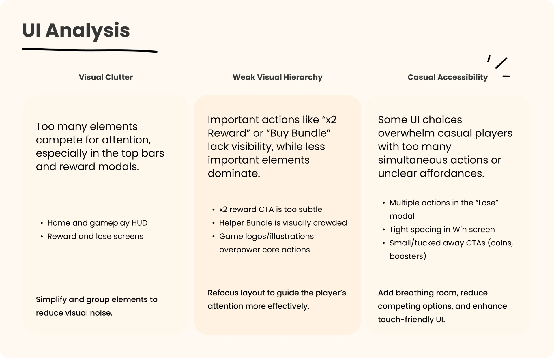
Looking at the in-game UI, I focused on how layout, hierarchy and visual cues affect usability. Three patterns kept coming back: visual clutter, weak hierarchy and choices that overwhelm a casual player.
04Where it hurts most
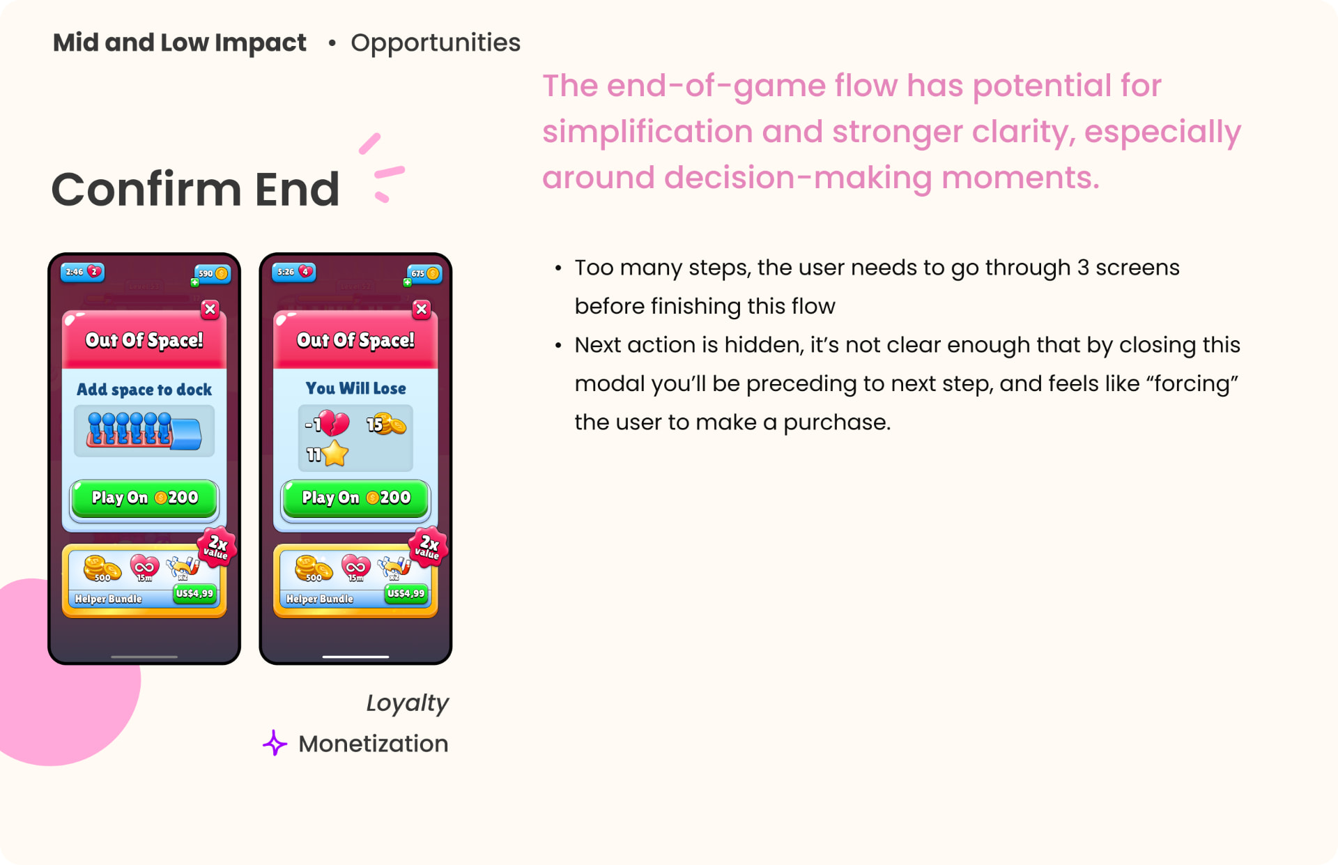
Losing took three screens and felt like a push to buy.
The end-of-game flow had the clearest friction: three screens before you could leave, and a hidden X as the only way out. My suggestions were all low effort: merge the screens into one, replace the X with a visible “Accept loss and return”, and use emotional copy like “Recover your stars!” for the paid option.
05New moments to buy
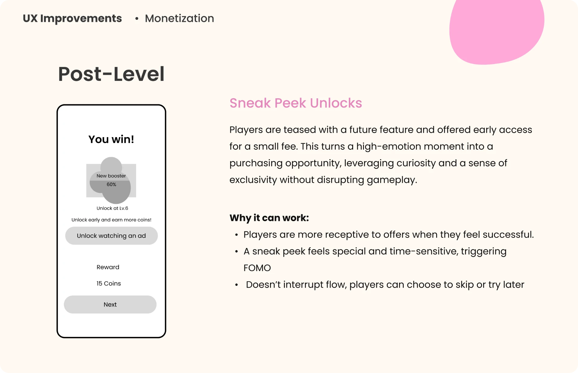
A purchase moment that feels earned, not forced.
I had more ideas brewing, but this one shows the logic behind all of them: make the offer when the player feels successful, not when they feel frustrated. A high-emotion moment becomes a purchase moment, without interrupting the game.
06Questions for data
What I would ask before building anything.
A take-home comes with no data, so I wrote down what I would explore with product and data to validate or redirect each decision.
- 01. Where are players dropping off most? A specific level, or a step in the flow?
- 02. How do players use the store? Do they go there on their own, or only through prompts?
- 03. Which bundle or offer converts best? Is there a clear favorite, or patterns by type of player?
- 04. What does the average player look like? Age, motivations, favorite modes, time per session.
- 05. Do players tend to buy in their first sessions, or later on?
07What I took from it
Small tweaks to flow and context can unlock moments that feel natural.
Thinking through these proposals pushed me beyond screens, toward emotion, behavior and timing. None of it shipped, but it shows how I approach a product I didn’t build: start from the system, find the moments with the most emotion, and change as little as possible to make them clearer.